Anatomy of a Perfect Webinar Landing Page (includes a helpful checklist and real-life examples)
Posted in Landing Page Tips on January 4, 2024 by Ramin Zamani ‐ 8 min read

Add these 11 elements to your webinar landing page to ensure it’s optimized for the best user experience and the most possible registrations.
Webinar Registration Landing Page
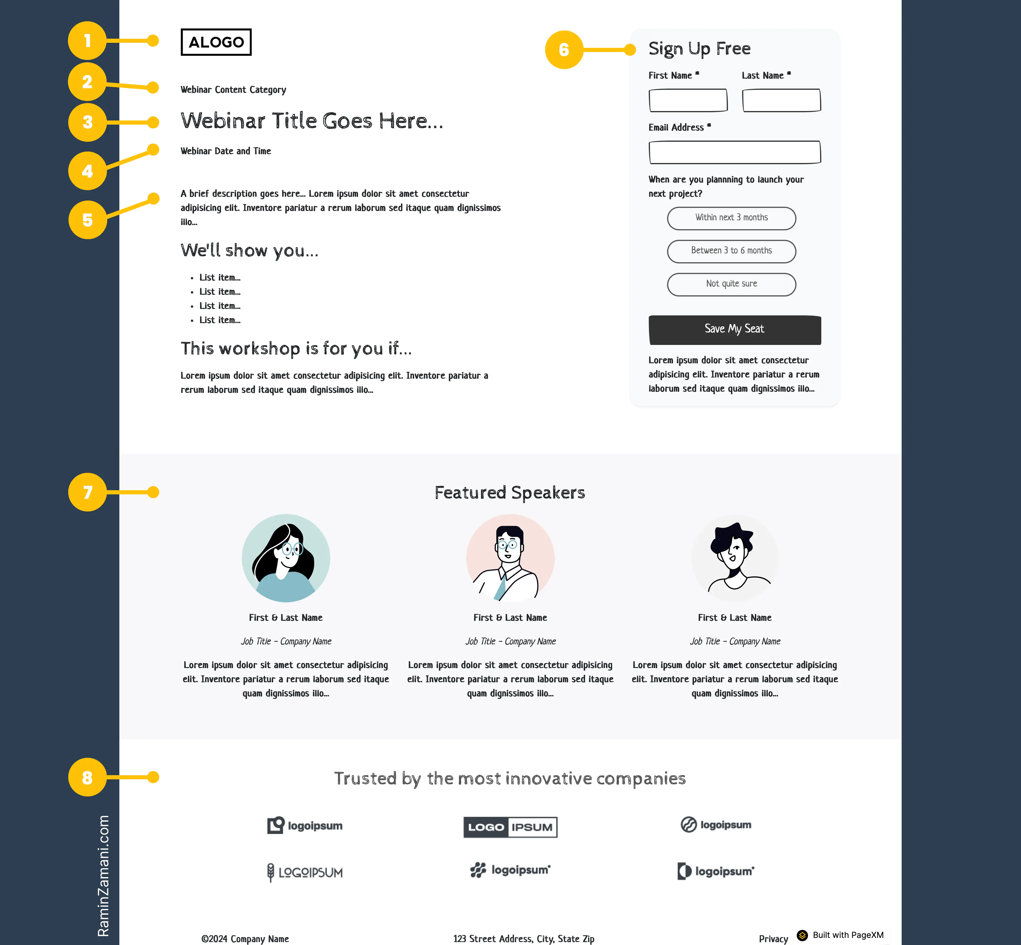
Anatomy of a perfect webinar registration landing page. See this wireframe live here.
Some of these may seem obvious, but when it comes to boosting your landing page conversion rate, details matter. Creating a landing page with a great user experience is all about micro-interactions. Review these elements carefully to see how to improve your webinar landing page—even a tiny improvement counts.
1. Clear Branding
Add your logo and name to the landing page to let the registrants know who’s hosting the webinar.
Key ingredients of a perfect webinar header: 1) Branding, 2) Positioning, 3) Headline, and 4) Date/Time.
2. Right Positioning
Position your webinar as a training session. Call it a “workshop,” a “training class,” or an “educational session.” Reassure your potential registrants that the content is educational. No one wants to attend a lengthy sales pitch.
If you’re hosting a free webinar, make sure you mention that.
3. Descriptive Headline
The registration landing page headline is usually, but not necessarily, the webinar’s title. The webinar’s title must promise a specific, tangible benefit that the webinar content delivers.
Here are a few good examples:
“Discover How You Can Profitably Add Google Ads to Your Service Stack”
“Connecting Better: Al’s Role in Personalizing Donor Experiences”
“PRINT OUTLOOK 2024: WHAT TO EXPECT IN THE COMING YEAR”
“Unlock worldwide scale with Webflow Localization”
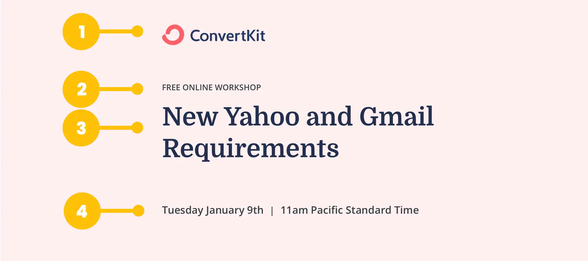
“New Yahoo and Gmail Requirements”
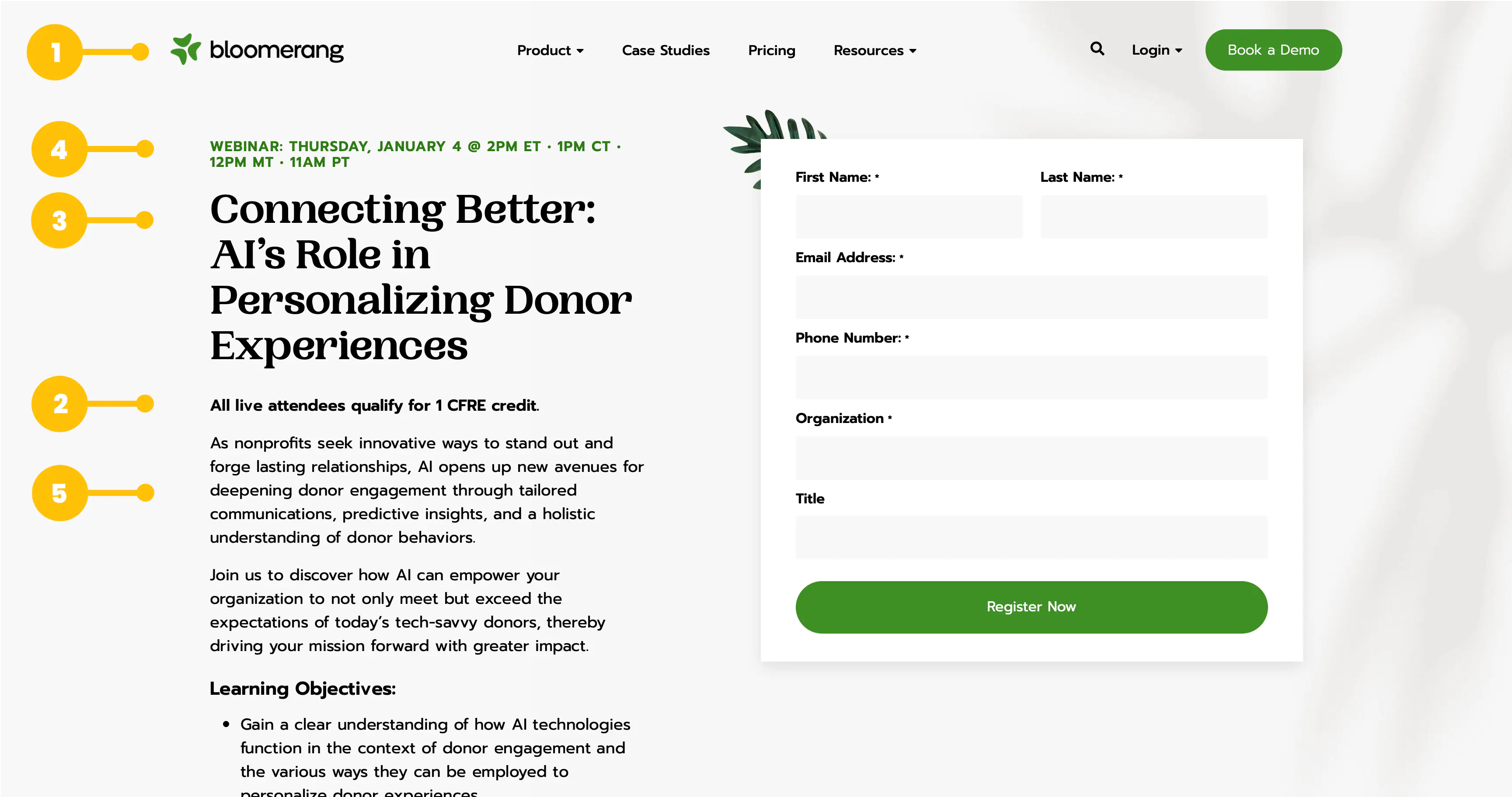
Bloomerang's webinar page is a great example of a landing page that includes all the key ingredients in a stylish layout.
4. Specific Webinar’s Date and Time
Make sure the webinar’s date and time are easy to find on the registration landing page and:
- For date: Specify the week of the day. So instead of “January 9th,” say “Tuesday, January 9th,” because otherwise, the registrants need to figure out which day it is and see if that day works for them. Make it easy for them.
- For time: Specify the time zone. Mention multiple time zones if needed. Ideally, show the time zone dynamically based on each visitor’s time zone, or allow them to pick their time zone, like this example shown below:
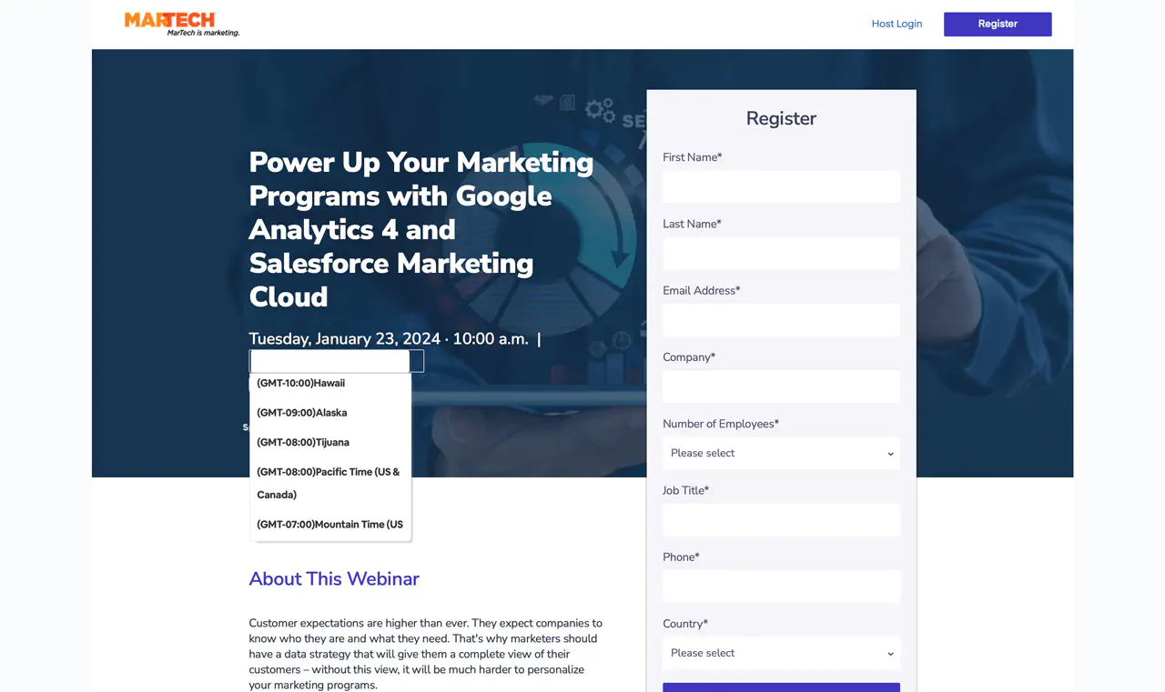
Dynamic time zone selection for webinar landing pages.
5. Informative Webinar Description
Your webinar description must answer three questions for your registrants: Why, What, and Who.
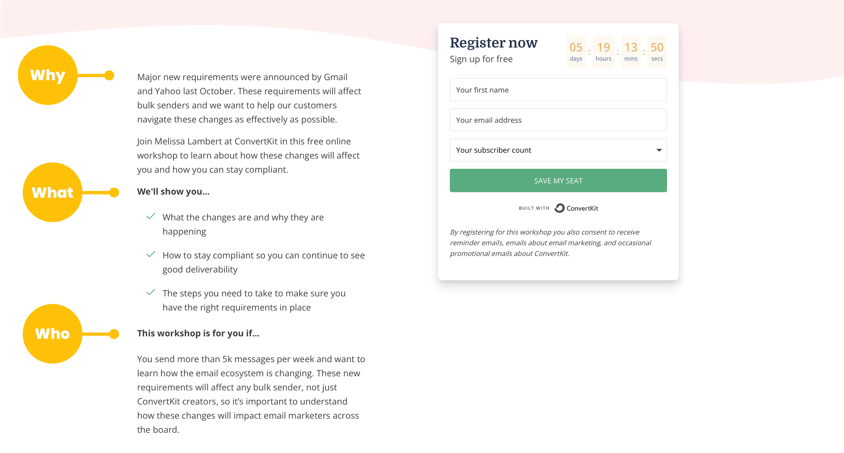
Convert Kit's webinar page clearly resonates with their intended target audience. Click on the image to enlarge it and read the copy.
Why should you attend this webinar?
Establish the need. Be specific. Here are a few excellent reasons:
- It solves a particular problem for your audience.
- It explains a new change in the industry and its impact on your audience.
- It introduces a new opportunity that your audience can benefit from.
What you’ll get from this webinar?
Include 3 or 4 bullet points on what you’ll show them during the webinar. Make them interesting.
Who is this webinar for?
Identify the ideal target audience for this webinar and ensure it resonates with those who benefit most. Again, be specific. See how Convert Kit’s webinar target audience is defined:
This workshop is for you if…
You send more than 5k messages per week and want to learn how the email ecosystem is changing. These new requirements will affect any bulk sender, not just ConvertKit creators, so it’s important to understand how these changes will impact email marketers across the board.
6. Optimized Webinar Registration Form:
When it comes to webinar landing page conversions, the registration form is the most important factor. Here are some best practices to boost your webinar registration rates:
Be sure your form is visible above the fold.
Your registration form should be in a prominent position on your landing page.
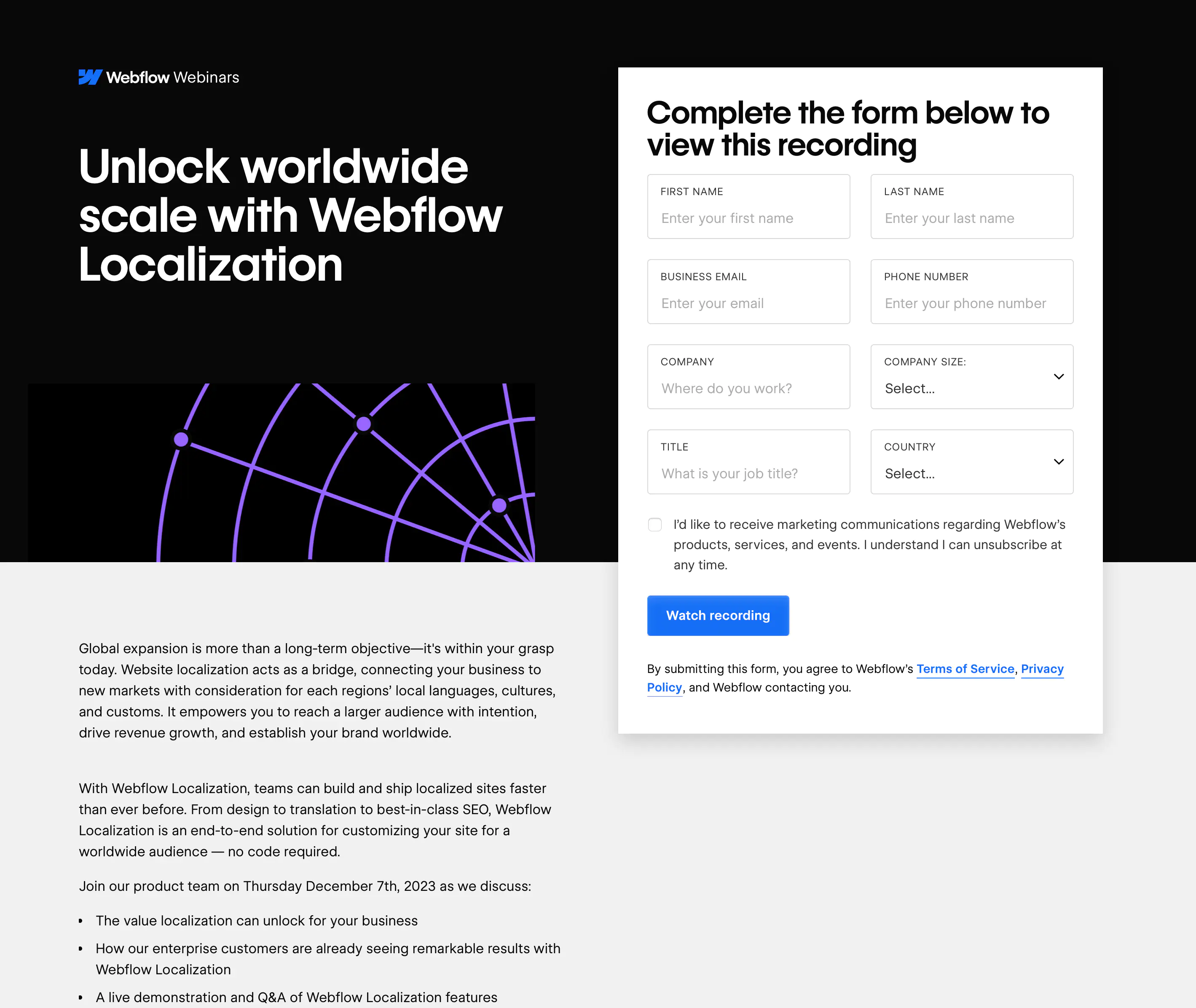
Webflow's webinar registration form stands out.
Make the form “sticky”.
If your landing page is long, people must scroll down to see all the content. On a desktop or laptop device, a sticky form will remain visible on the screen even if the visitors scroll.
Here’s a screenshot of the same Webflow’s webinar landing page shown above. See how the form stays in the view even when the visitors scroll down to the botton of the page:
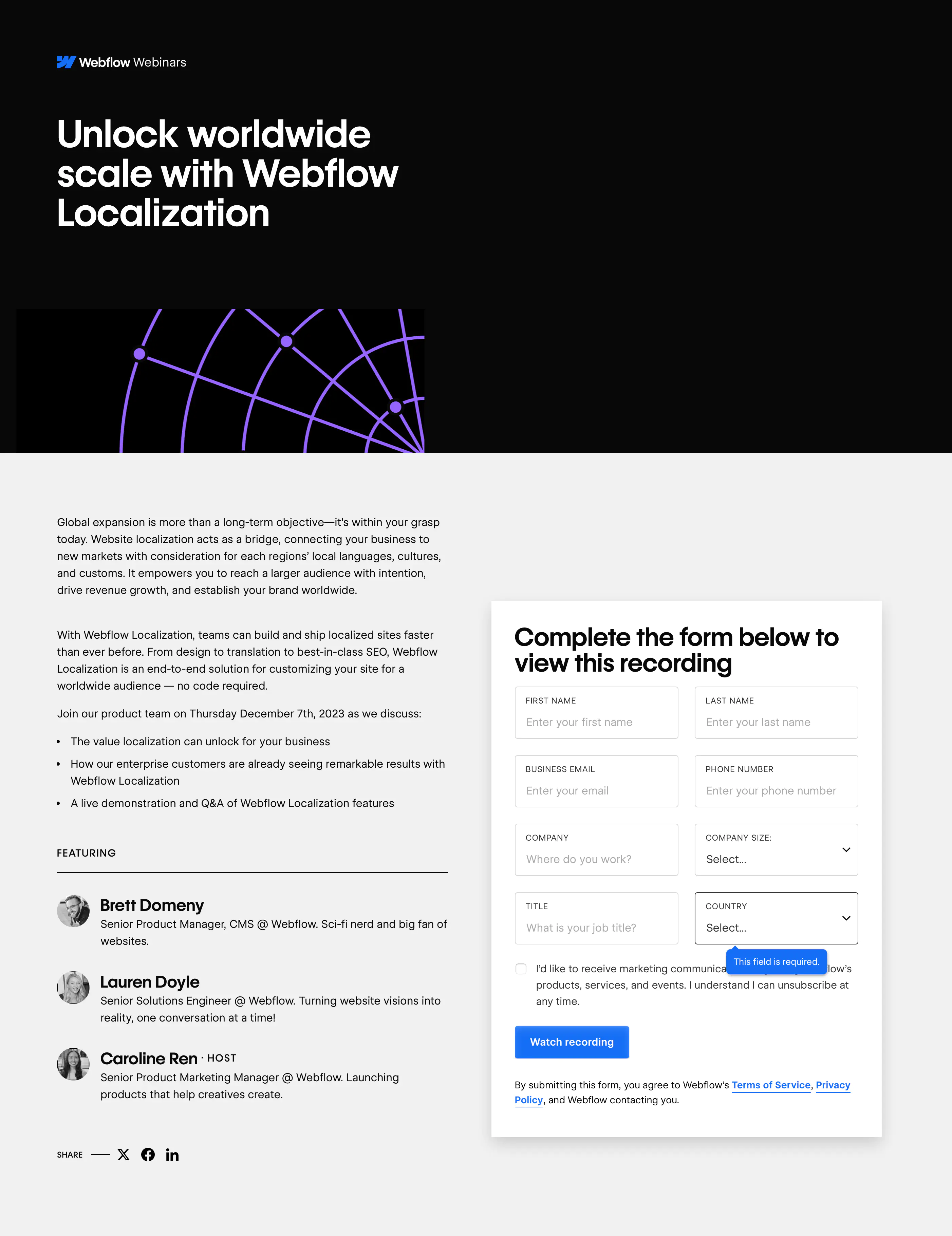
Webflow's webinar registration form stays in the view when you scroll down the page.
Add a clear headline inviting people to register.
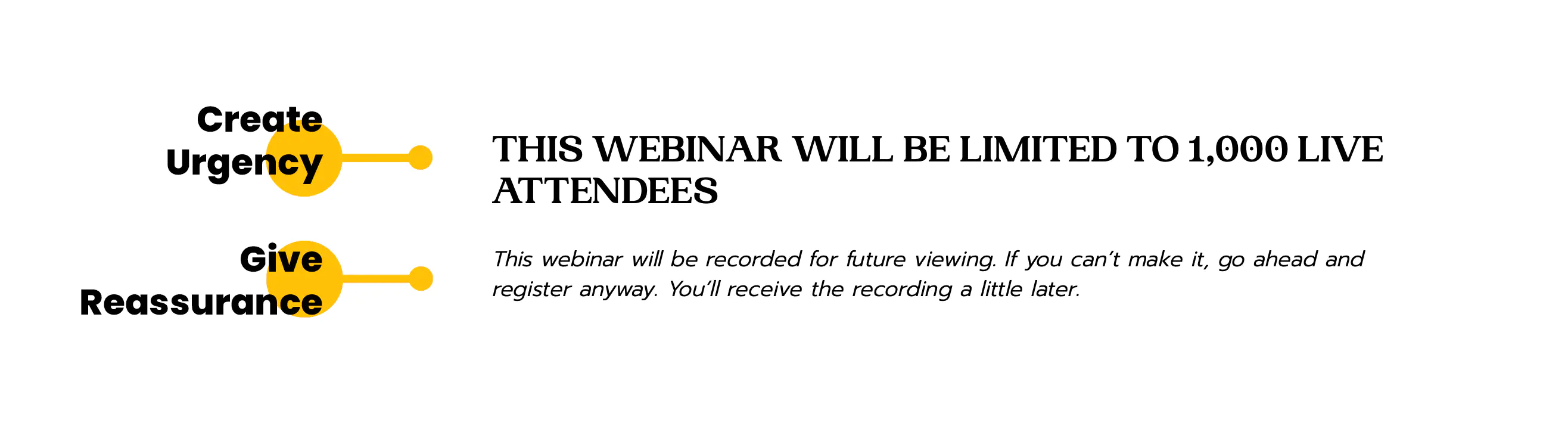
Optionally, add a count-down timer to create a sense of urgency.
Don’t use “Submit” for your button text. Use “Register Now”, “Save My Seat”, “Sign Me Up”, or other action-oriented, exciting call-to-actions.
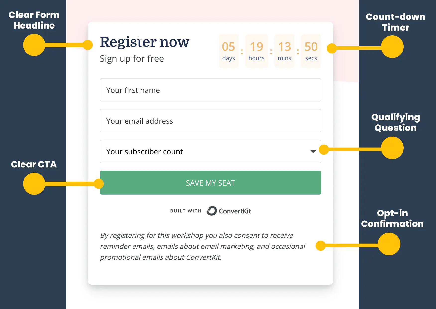
Convert Kit's form is a fantastic example of a webinar registration form.
Be clear about what you’ll do with the registrants’ information. Include an opt-in statement just below the form’s button, and add a link to your privacy policy page to the footer of your landing page.
Keep the form short.
Studies show that the more fields you have on your form, the less likely people are to fill it out. So only ask for what you absolutely need. To learn more about the optimal number of fields in a form, read my article here.
Printing Impressions, a leading publication in the US print industry, hosts great webinars featuring industry experts. They have many key elements of a great webinar landing page, such as branding, positioning, title, description, and speaker information, but the registration form needs to be shorter!
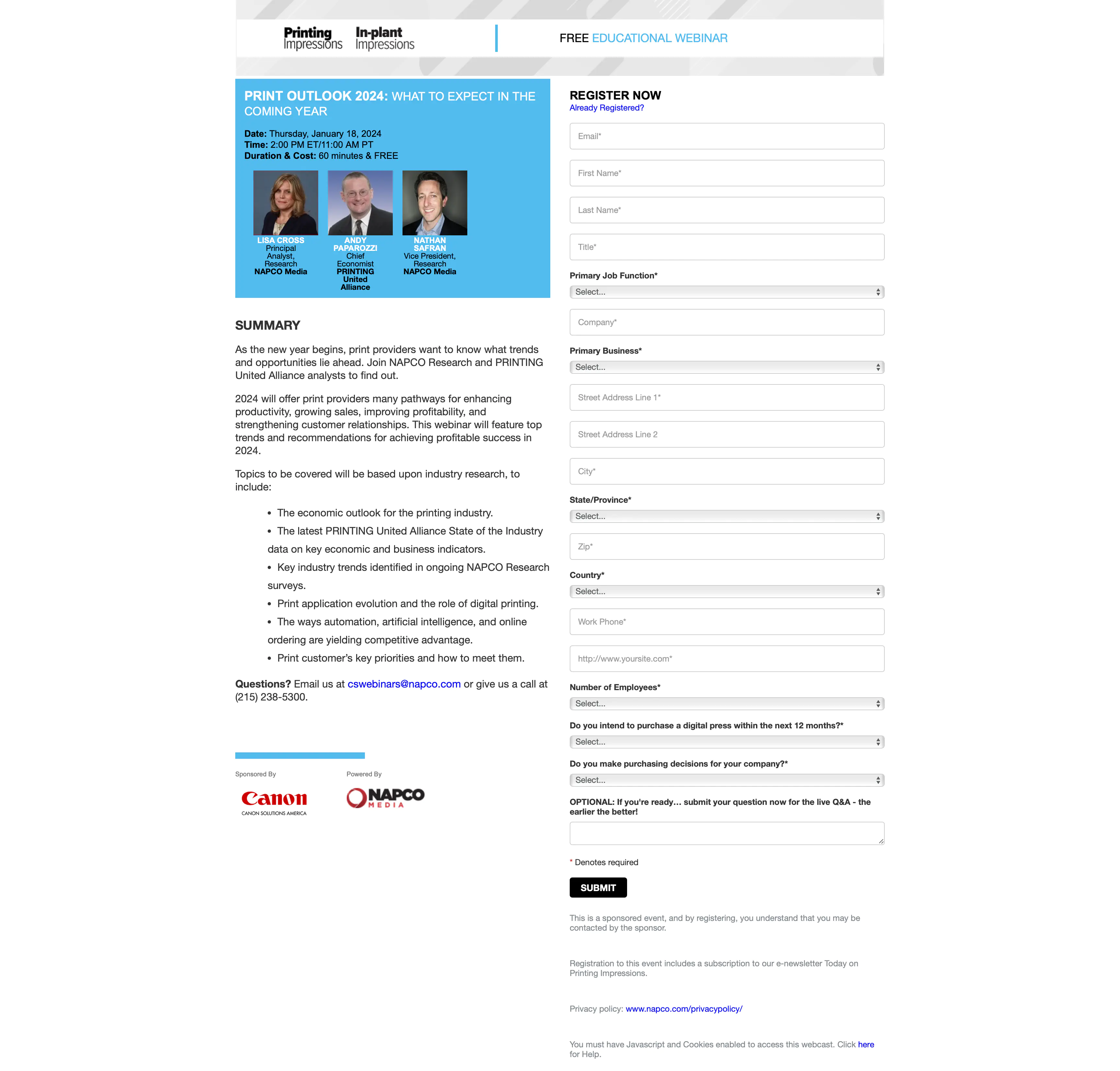
You must be *really* interested in the topic of the webinar to fill out a form this long.
Optimize your form for mobile devices.
More than half of your landing page visitors will likely come from mobile devices. Be sure your form is easy to fill out on mobile.
The example below shows how you can optimize your form fields for a better user experience on mobile devices:
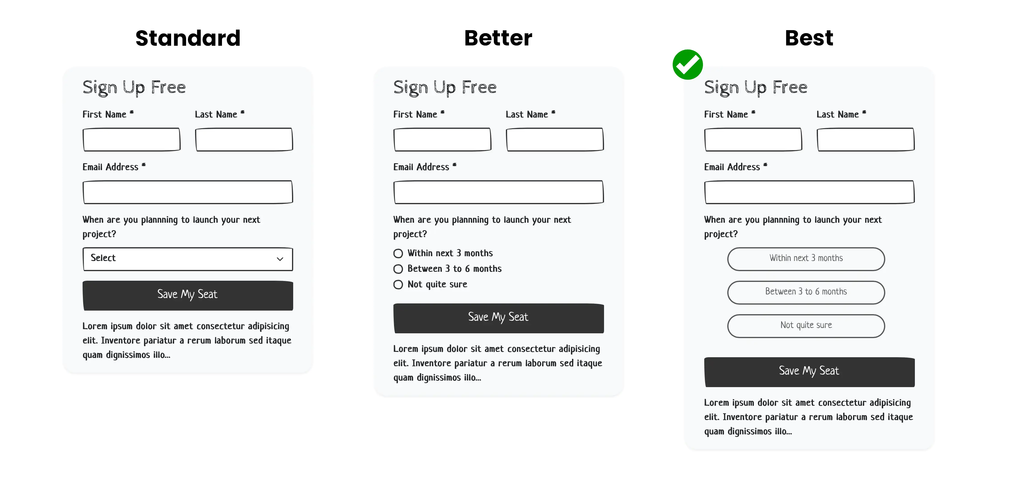
A mobile-optimized form uses form control fields that are easy to use on phones.
The last question is the same in the three options shown above. The “Standard” form uses a “Select” field. Visitors cannot see all the options, so they must click on the form control before selecting an option. Clicking on a “Select” field may cause the screen to “zoom” in or out, interrupting the visitors’ flow.
In the “Better” layout, the “Select” field has been replaced with a “Radio” field. This simple change makes the options readily available and eliminates the need for an extra click.
The “Best” layout takes it further by replacing the standard Radio options with large buttons that are much easier to click on.
Social media platform like LinkedIn and Instagram use mobile-optimized forms to enhance their “Lead Ad” forms experience to help marketers boost their conversions.
Personalize and pre-populate the form fields.
If you’ve sent them an email with a link to the webinar registration landing page, don’t ask them to enter their email address again. Remove the fields that you already know or, at minimum, pre-populate them.
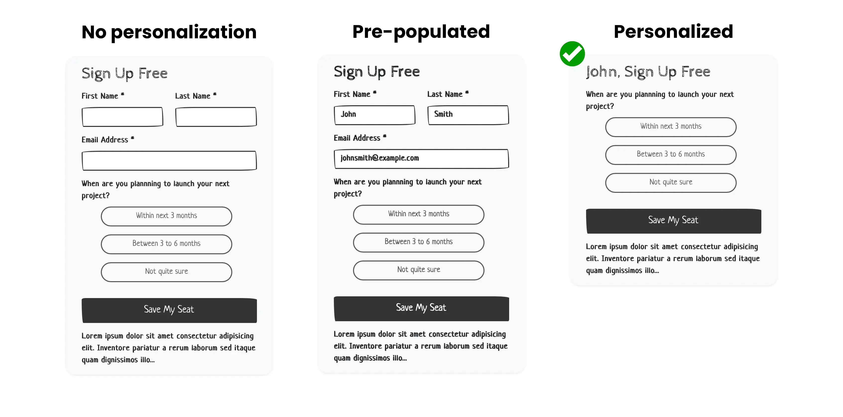
Using a marketing automation platform like MindFire enables marketers to host personalized landing pages with pre-populated or fully-personalized forms like those shown above.
Give reassurance.
Many people can’t or don’t intend to attend a live webinar, but if they are interested in the content, they’d like to see the recording and a copy of the slides. Let them know that if they register, they’ll still receive a copy even if they cannot attend.
7. Detailed Speaker(s) Information
Introduce your speakers, moderators, and other guests who’ll be presenting in the webinar. Highlight their key accomplishments to establish authority.
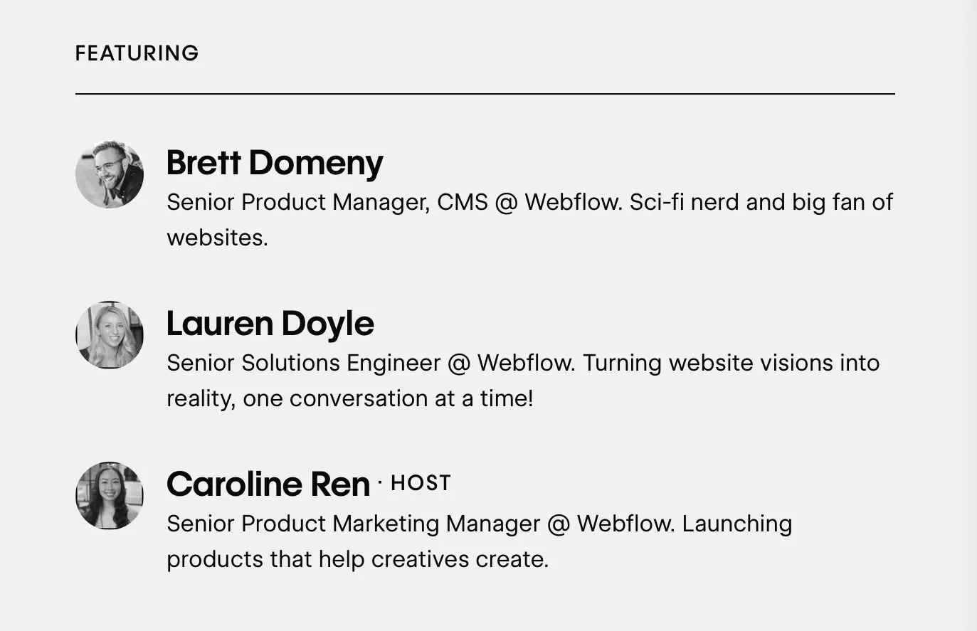
Include their headshot, title, and a brief but engaging bio for each host.
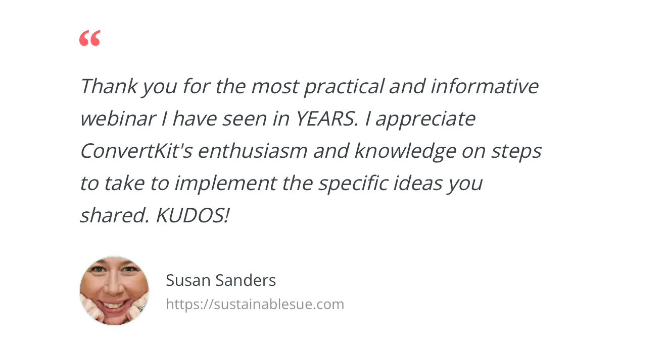
8. Social Proof
If you have a history of running successful webinars, include one of two testimonials from past attendees to demonstrate the value your potential registrants will get from your webinar.
Alternatively, add logos of your customers.
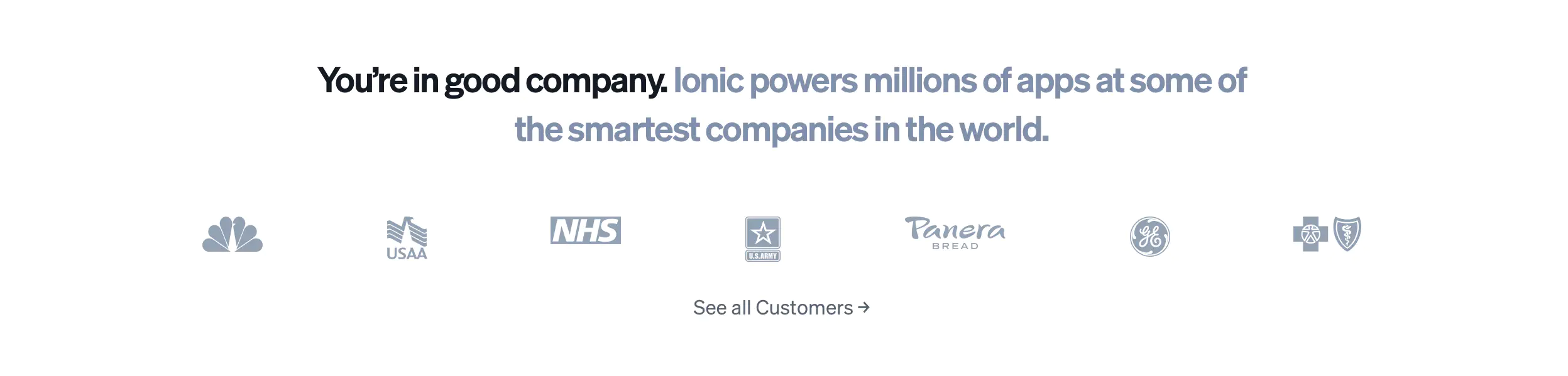
Strengthen your position as an expert while helping the visitors see the actual gains they can expect.
Webinar Confirmation Landing Page
Your registration experience is only complete with these elements on your thank-you or confirmation page.
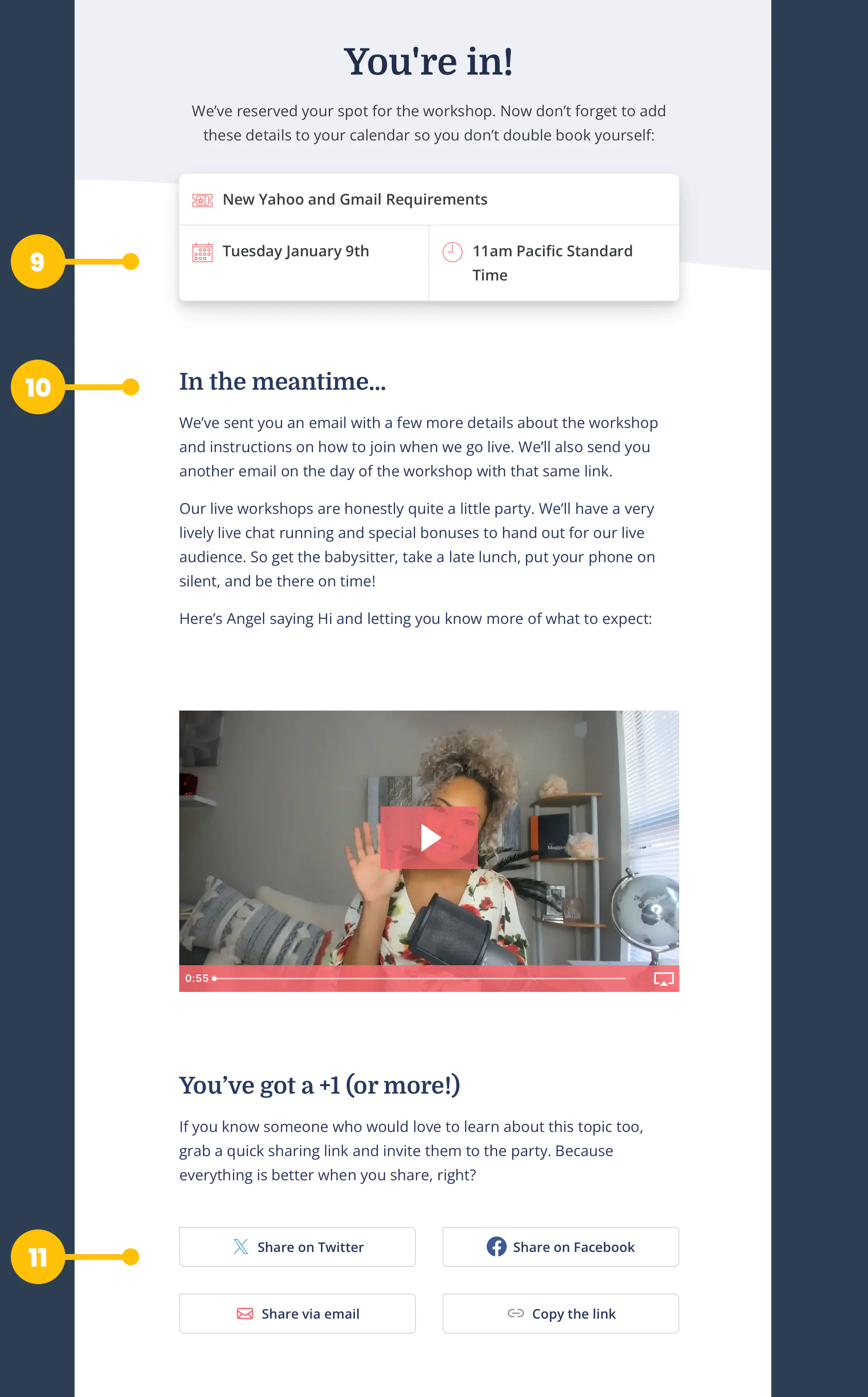
Convert Kit's webinar confirmation landing page follows the best practices.
9. Add-to-Calendar Button
Many business people manage their days based on the events on their calendars. To maximize the attendance rate of registrants, you want to have your webinar added to their calendar.
10. In the meantime…
A confirmation landing page is the perfect place to offer additional value. Remember, the person who just registered for your webinar is highly engaged and is likely to be interested in your offerings, so seize the opportunity and show them what else you can do for them.
Here are a few examples of what to include in your post-registration landing page:
- A video describing your essential product or service.
- A link to download a piece of content related to the topic of the webinar they just signed up for.
- A form with additional questions to better understand the visitor’s intent and or to qualify them.
- Links to your other educational resources.
11. Sharing Buttons
Give the registrant an easy way to share the registration link with their friends and colleagues. Most people want to help others succeed, so if they’ve seen value in your content, make it easier for them to spread the word.
Download this checklist for your next webinar landing page.
Found this post helpful?
Subscribe to my newsletter and get posts like this in your inbox.
Found this post helpful?
Subscribe to my newsletter and get posts like this in your inbox.